Typographical Facts
[from Gutenberg-Festschrift, Mainz 1925]
Typographical Facts
[from Gutenberg-Festschrift, Mainz 1925]
YOU see here that the pattern of thought cannot be represented mechanically by making combinations of the twenty-six letters of the alphabet. Language is more than just an acoustic wave motion, and the mere means of thought transference. In the same way typography is more than just an optical wave motion for the same purpose. From the passive, non-articulated lettering pattern one goes over to the active, articulated pattern. The gesture of the living language is taken into account. eg: the Hammurabi tablets and modern election literature.
YOU have divided up the day into twenty-four hours. There is not another hour for extravagant effusion of feelings. The pattern of speech becomes increasingly concise, the gesture sharply imprinted. It is just the same with typography. eg: Prospectuses, advertising brochures, and modern novels.
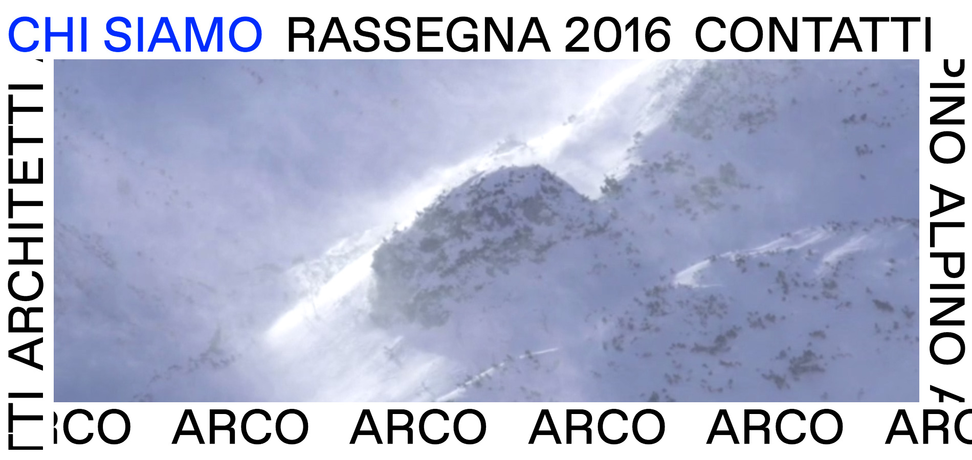
YOU are accompanied from your first day onwards by printed paper digital screens, and your eye is superbly trained to find its way about in this specific field quickly, precisely, and without losing its way. You cast your glances into these forests of paper web of links with the same confidence as the Australian throws his boomerang. eg: the page of a large daily paper.
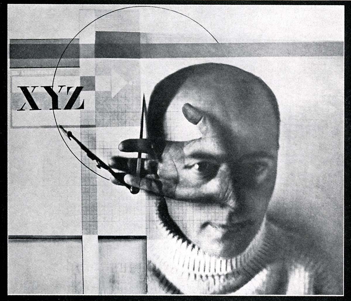
YOU ask for clear patterns for your eyes. Those can only be pieced together from plain elements. The elements of the letters are:

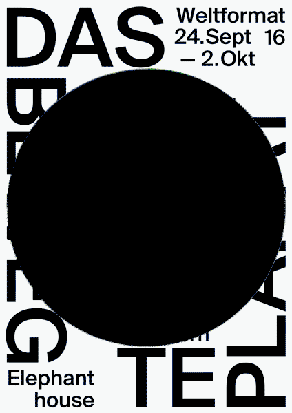
These are the basic line-directions on the plain surface. Combinations occur in the horizontal and perpendicular directions. These two lines produce the right (unambiguous) angle. It can be placed in alignment with the edges of the surface, then it has a static effect (rest). It can be placed diagonally, then it has a dynamic effect (agitation). These are the axioms of typography. eg: this page.
YOU are already overcoming the prejudice which regards only letterpress-printing (from type) as pure typography. Letterpress belongs to the past. The future belongs to photogravure printing and to all photochemical digital processes. In this way the former fresco-painting is cut off from the new typography. eg: advertisement pillars and poster-walls.
YOU have observed that in an organic pattern all the facets exhibit the same structural unity. Modern typography is improving structural unity. eg: The paper (art paper), the type (absence of flourishes), the ink (the new spectrum-clear products).
YOU can see how it is that where new areas are opened up to thought- and speech-patterns, there you find new typographical designs originating organically. These are: modern advertising and modern poetry. eg: Some pages of American and European magazines and technical periodicals. The international publications of the dada movement.
YOU should demand of the writer that he really presents what he writes; his ideas reach you through the eye and not through the ear. Therefore typographical form should do by means of optics what the voice and gesture of the writer does to convey his ideas.
eg: As you have more faith in your grandparents’ generation, let us consider this small example by Master Francis Rabelais, abstractor of the quintessence:
O, i? ... am the great tamer of the Cimbri
: : ; . ted through the air, because the dew annoyed him.
he appeared, went putting clods in the troughs.
! of fresh butter, which with great tubs;
Gargantua, Book 1, Chapter 2.